Chapter 1 Visualizing
The goal of this case study is to start making graphs that help us understand our data better. We will be using the ggplot2 package and perhaps some add-ons for making graphs. This is but one of a few different graphical systems in R. The main ones are:
base- the base graphics available in R. They are great for quick plots, but for publication-quality plots, we can do better.lattice- based on the Trellis graphics system developed at Bell Labs in the 1990s to implement many of the theoretical ideas discussed by William Cleveland. In R, it is based on thegridpackage, though we usually don’t interact directly with the functions ingrid.
ggplot2- is also based ongrid, but is intended to implement Wilkinson’s vision in The Grammar of Graphics of model-based graphical displays.
Since we’re supposed to all be together in Boulder, I thought our first exercise would be to generate some visual insights on the COVID-19 pandemic in Colorado. We’re going to walk through all of the steps that we would use from reading in the data, to managing it to making plots. The first thing we want to do is read in some baseline demographic data. I’ve already got these coded in R.
load("data/colo.rda")
library(summarytools)
We can see what variables are there:
| No | Variable | Label | Stats / Values | Freqs (% of Valid) | Graph | Valid | Missing |
|---|---|---|---|---|---|---|---|
| 1 | fips [character] |
FIPS code | 1. 08001 2. 08003 3. 08005 4. 08007 5. 08009 6. 08011 7. 08013 8. 08014 9. 08015 10. 08017 [ 54 others ] |
1 ( 1.6%) 1 ( 1.6%) 1 ( 1.6%) 1 ( 1.6%) 1 ( 1.6%) 1 ( 1.6%) 1 ( 1.6%) 1 ( 1.6%) 1 ( 1.6%) 1 ( 1.6%) 54 (84.4%) |
IIIIIIIIIIIIIIII |
64 (100.0%) |
0 (0.0%) |
| 2 | county [character] |
County name | 1. Adams 2. Alamosa 3. Arapahoe 4. Archuleta 5. Baca 6. Bent 7. Boulder 8. Broomfield 9. Chaffee 10. Cheyenne [ 54 others ] |
1 ( 1.6%) 1 ( 1.6%) 1 ( 1.6%) 1 ( 1.6%) 1 ( 1.6%) 1 ( 1.6%) 1 ( 1.6%) 1 ( 1.6%) 1 ( 1.6%) 1 ( 1.6%) 54 (84.4%) |
IIIIIIIIIIIIIIII |
64 (100.0%) |
0 (0.0%) |
| 3 | cases [integer] |
Number of COVID-19 cases to date | Mean (sd) : 8882.3 (18362.4) min < med < max: 30 < 1461.5 < 75016 IQR (CV) : 3637.5 (2.1) |
62 distinct values | : : : : : |
64 (100.0%) |
0 (0.0%) |
| 4 | deaths [integer] |
Number of COVID-19 deaths to date | Mean (sd) : 109.9 (228.9) min < med < max: 0 < 17.5 < 887 IQR (CV) : 62.2 (2.1) |
41 distinct values | : : : : : . . |
64 (100.0%) |
0 (0.0%) |
| 5 | st [character] |
State abbreviation | 1. CO | 64 (100.0%) | IIIIIIIIIIIIIIIIIIII | 64 (100.0%) |
0 (0.0%) |
| 6 | hospitals [integer] |
# Hospitals in the county | Mean (sd) : 1.2 (1.3) min < med < max: 0 < 1 < 6 IQR (CV) : 1.2 (1) |
0 : 17 (26.6%) 1 : 31 (48.4%) 2 : 7 (10.9%) 3 : 5 ( 7.8%) 4 : 1 ( 1.6%) 5 : 2 ( 3.1%) 6 : 1 ( 1.6%) |
IIIII IIIIIIIII II I |
64 (100.0%) |
0 (0.0%) |
| 7 | icu_beds [integer] |
# ICU beds in the county | Mean (sd) : 25 (74.1) min < med < max: 0 < 0 < 506 IQR (CV) : 6.5 (3) |
20 distinct values | : : : : : |
64 (100.0%) |
0 (0.0%) |
| 8 | tpop [numeric] |
Total population (2009 ACS) | Mean (sd) : 177986.4 (362030.9) min < med < max: 1524 < 30028 < 1432984 IQR (CV) : 75579.5 (2) |
64 distinct values | : : : : : . |
64 (100.0%) |
0 (0.0%) |
| 9 | mpop [numeric] |
Male Population (2009 ACS) | Mean (sd) : 0.5 (0) min < med < max: 0.5 < 0.5 < 0.7 IQR (CV) : 0 (0.1) |
64 distinct values | : : : : : : : . |
64 (100.0%) |
0 (0.0%) |
| 10 | fpop [numeric] |
Female Population (2009 ACS) | Mean (sd) : 0.5 (0) min < med < max: 0.3 < 0.5 < 0.5 IQR (CV) : 0 (0.1) |
64 distinct values | : : : : : . : : |
64 (100.0%) |
0 (0.0%) |
| 11 | white_male [numeric] |
White male proportion | Mean (sd) : 0.5 (0) min < med < max: 0.4 < 0.5 < 0.6 IQR (CV) : 0 (0.1) |
64 distinct values | : : : : . : : : |
64 (100.0%) |
0 (0.0%) |
| 12 | white_female [numeric] |
White female proportion | Mean (sd) : 0.4 (0) min < med < max: 0.2 < 0.5 < 0.5 IQR (CV) : 0 (0.1) |
64 distinct values | : . : : : : : . : : |
64 (100.0%) |
0 (0.0%) |
| 13 | white_pop [numeric] |
White population proportion | Mean (sd) : 0.9 (0) min < med < max: 0.8 < 0.9 < 1 IQR (CV) : 0 (0) |
64 distinct values | : : : : : . : : : |
64 (100.0%) |
0 (0.0%) |
| 14 | black_male [numeric] |
Black male proportion | Mean (sd) : 0 (0) min < med < max: 0 < 0 < 0.1 IQR (CV) : 0 (1.4) |
64 distinct values | : : : : : . . |
64 (100.0%) |
0 (0.0%) |
| 15 | black_female [numeric] |
Black female proportion | Mean (sd) : 0 (0) min < med < max: 0 < 0 < 0.1 IQR (CV) : 0 (1.5) |
62 distinct values | : : : : : . |
64 (100.0%) |
0 (0.0%) |
| 16 | black_pop [numeric] |
Black population proportion | Mean (sd) : 0 (0) min < med < max: 0 < 0 < 0.1 IQR (CV) : 0 (1.2) |
64 distinct values | : : : : : : |
64 (100.0%) |
0 (0.0%) |
| 17 | hisp_male [numeric] |
Hispanic male proportion | Mean (sd) : 0.1 (0.1) min < med < max: 0 < 0.1 < 0.3 IQR (CV) : 0.1 (0.7) |
64 distinct values | : : . : : : . . : : : : : |
64 (100.0%) |
0 (0.0%) |
| 18 | hisp_female [numeric] |
Hispanic female proportion | Mean (sd) : 0.1 (0.1) min < med < max: 0 < 0.1 < 0.3 IQR (CV) : 0.1 (0.7) |
64 distinct values | : : : : : : : : . . : : : : : . |
64 (100.0%) |
0 (0.0%) |
| 19 | hisp_pop [numeric] |
Hispanic population proportion | Mean (sd) : 0.2 (0.1) min < med < max: 0.1 < 0.1 < 0.6 IQR (CV) : 0.2 (0.7) |
64 distinct values | : : : : : : . . : : : : : |
64 (100.0%) |
0 (0.0%) |
| 20 | over60_pop [numeric] |
Over 60 population proportion | Mean (sd) : 0.6 (0) min < med < max: 0.6 < 0.6 < 0.7 IQR (CV) : 0 (0) |
64 distinct values | : . : : : : : : : : : . : : : : : : |
64 (100.0%) |
0 (0.0%) |
| 21 | over60_male [numeric] |
Over 60 male proportion | Mean (sd) : 0.3 (0) min < med < max: 0.3 < 0.3 < 0.5 IQR (CV) : 0 (0.1) |
64 distinct values | : . : : : : : : : : . |
64 (100.0%) |
0 (0.0%) |
| 22 | over60_female [numeric] |
Over 60 female proportion | Mean (sd) : 0.3 (0) min < med < max: 0.2 < 0.3 < 0.3 IQR (CV) : 0 (0.1) |
64 distinct values | : : : : : : . : : : |
64 (100.0%) |
0 (0.0%) |
| 23 | lt25k [numeric] |
Proportion making less than $25,000/year | Mean (sd) : 0.2 (0.1) min < med < max: 0.1 < 0.3 < 0.5 IQR (CV) : 0.1 (0.4) |
64 distinct values | : : . : : : : : : : : : : : : : : : : : : : : : : : : . |
64 (100.0%) |
0 (0.0%) |
| 24 | gt100k [numeric] |
Proportion making more than $100,000/year | Mean (sd) : 0.2 (0.1) min < med < max: 0 < 0.1 < 0.5 IQR (CV) : 0.1 (0.6) |
64 distinct values | : : . : : : . : : : : : : : . : |
64 (100.0%) |
0 (0.0%) |
| 25 | nohs [numeric] |
Proportion without a high school degree | Mean (sd) : 0.1 (0.1) min < med < max: 0 < 0.1 < 0.3 IQR (CV) : 0.1 (0.5) |
64 distinct values | . : : : . : : : : : : : : : : : : |
64 (100.0%) |
0 (0.0%) |
| 26 | BAplus [numeric] |
Proportion with a BA/S degree or greater | Mean (sd) : 0.3 (0.1) min < med < max: 0.1 < 0.2 < 0.6 IQR (CV) : 0.2 (0.4) |
64 distinct values | : : : : : : : : . : . : : : : : : : : . . |
64 (100.0%) |
0 (0.0%) |
| 27 | repvote [numeric] |
Republican share of two-party vote in 2020 | Mean (sd) : 0.6 (0.2) min < med < max: 0.2 < 0.6 < 0.9 IQR (CV) : 0.3 (0.3) |
64 distinct values | : . : . : . : : : : : . . : : : : : : : : : : : : |
64 (100.0%) |
0 (0.0%) |
| 28 | urban_rural [factor] |
Census Urban-rural classification | 1. Metro >1M 2. Metro 250k-1M 3. Metro < 250k 4. UP > 20k, adj 5. UP < 20k, non-adj 6. UP 2500-20k, adj 7. UP 2500-20k, non-adj 8. Rural, adj 9. Rural, non-adj |
10 (15.6%) 5 ( 7.8%) 2 ( 3.1%) 3 ( 4.7%) 3 ( 4.7%) 6 ( 9.4%) 15 (23.4%) 3 ( 4.7%) 17 (26.6%) |
III I I IIII IIIII |
64 (100.0%) |
0 (0.0%) |
| 29 | tot_pop [integer] |
Total Poulation (Colorado Estimate) | Mean (sd) : 90062.1 (183363.4) min < med < max: 726 < 15105.5 < 729239 IQR (CV) : 38011.5 (2) |
64 distinct values | : : : : : . |
64 (100.0%) |
0 (0.0%) |
| 30 | full_vac_pop [integer] |
Number of fully vaccinated people | Mean (sd) : 46407.9 (98270) min < med < max: 420 < 6631 < 437037 IQR (CV) : 15386.2 (2.1) |
64 distinct values | : : : : : |
64 (100.0%) |
0 (0.0%) |
| 31 | pct_vac_pop [numeric] |
Proportion of total population that is fully vaccinated | Mean (sd) : 44.6 (13.6) min < med < max: 16.4 < 42.9 < 78.2 IQR (CV) : 19.5 (0.3) |
63 distinct values | . : : : . . : : : . : : : : : . : : : : : . |
64 (100.0%) |
0 (0.0%) |
| 32 | eligible_pop [integer] |
Number of people eligible for the vaccine (12+) | Mean (sd) : 77351.3 (156889.4) min < med < max: 661 < 13084 < 632816 IQR (CV) : 33153.2 (2) |
64 distinct values | : : : : : |
64 (100.0%) |
0 (0.0%) |
| 33 | full_vac_eligible [integer] |
Number of eligible people vaccinated | Mean (sd) : 46407.1 (98268.6) min < med < max: 420 < 6631 < 437030 IQR (CV) : 15386 (2.1) |
64 distinct values | : : : : : |
64 (100.0%) |
0 (0.0%) |
| 34 | pct_vac_eligible [numeric] |
Proportion of eligible population that is fully vaccinated | Mean (sd) : 51.2 (15.1) min < med < max: 17.9 < 49.5 < 85.9 IQR (CV) : 23 (0.3) |
62 distinct values | : . : : : : : . : : : : : . : : : : : : . |
64 (100.0%) |
0 (0.0%) |
| 35 | adult_pop [integer] |
Adult population (18+) | Mean (sd) : 70368.8 (142887.8) min < med < max: 613 < 11890.5 < 590056 IQR (CV) : 30172.8 (2) |
64 distinct values | : : : : : . . |
64 (100.0%) |
0 (0.0%) |
| 36 | full_vac_adult [integer] |
Number of adults who are fully vaccinated | Mean (sd) : 43782 (92506) min < med < max: 412 < 6469.5 < 415992 IQR (CV) : 14743.2 (2.1) |
64 distinct values | : : : : : . |
64 (100.0%) |
0 (0.0%) |
| 37 | pct_vac_adult [numeric] |
Proportion of adults who are fullyvaccinated | Mean (sd) : 53.8 (14.9) min < med < max: 18.4 < 53.1 < 88.6 IQR (CV) : 21.6 (0.3) |
61 distinct values | : : . : : . : : : : . : : : : : . . : : : : : : |
64 (100.0%) |
0 (0.0%) |
| 38 | over65_pop [integer] |
Number of people over the age of 65 | Mean (sd) : 13230.7 (24794.9) min < med < max: 199 < 2681 < 99332 IQR (CV) : 7059.2 (1.9) |
64 distinct values | : : : : : . . |
64 (100.0%) |
0 (0.0%) |
| 39 | full_vac_over65 [integer] |
Number of people over 65 who are fully vaccinated | Mean (sd) : 10693.3 (20642.6) min < med < max: 142 < 1975.5 < 85755 IQR (CV) : 5349 (1.9) |
64 distinct values | : : : : : . . |
64 (100.0%) |
0 (0.0%) |
| 40 | pct_vac_over65 [numeric] |
Proportion of those over 65 who are fully vaccinated | Mean (sd) : 71.7 (11.9) min < med < max: 34.8 < 70.8 < 93.9 IQR (CV) : 15.4 (0.2) |
59 distinct values | : : . : : . : : : : : : : : |
64 (100.0%) |
0 (0.0%) |
| 41 | phys_health [numeric] |
Average number of physically unhealthy days out of the last 30 (2016) | Mean (sd) : 3.4 (0.5) min < med < max: 2.5 < 3.3 < 4.8 IQR (CV) : 0.7 (0.1) |
20 distinct values | : . : : : : : : : : : : . |
64 (100.0%) |
0 (0.0%) |
| 42 | mental_health [numeric] |
Average number of mentally unhealthy days out of the last 30 (2016) | Mean (sd) : 3.5 (0.3) min < med < max: 2.9 < 3.5 < 4.4 IQR (CV) : 0.4 (0.1) |
15 distinct values | . : : : : : : . : : : : . . : : : : : : . |
64 (100.0%) |
0 (0.0%) |
| 43 | smoking_pct [numeric] |
Percentage of adults who currently smoke (2016) | Mean (sd) : 0.1 (0) min < med < max: 0.1 < 0.1 < 0.2 IQR (CV) : 0 (0.1) |
12 distinct values | : : : : : : : : : : : : . |
64 (100.0%) |
0 (0.0%) |
| 44 | inactivity [numeric] |
Percentage of adults over 20 reporting no leisure-time physical acticity (2016) | Mean (sd) : 0.2 (0) min < med < max: 0.1 < 0.2 < 0.3 IQR (CV) : 0.1 (0.2) |
16 distinct values | : : . : . : : : : : : : . : : : : : : : . |
64 (100.0%) |
0 (0.0%) |
| 45 | wkly_wage [numeric] |
Average Weekly Wage | Mean (sd) : 894.1 (219.3) min < med < max: 548 < 832 < 1606 IQR (CV) : 216.2 (0.2) |
64 distinct values | : : : : : : : . . : : : . . |
64 (100.0%) |
0 (0.0%) |
Next, we can download the most recent COVID-19 case data:
library(rio)
f <- "https://raw.githubusercontent.com/nytimes/covid-19-data/master/us-counties.csv"
covid <- import(f)load("data/colo_covid.rda")The data we downloaded has all of the counties across the US, so we’ll need to learn about how to subset and filter data. To this, we turn to the tidyverse.
1.1 Wrangling data
We’re going to use the dplyr package, which is part of the tidyverse, for wrangling data. There are tons of different ways to filter, subset, select, sample, etc… data, but the tidyverse functions are generally pretty intuitive (after a brief introduction) and simple. We can do lots of things with dplyr, but the most common operations could be boiled down to the following:
mutate()adds new variables that are functions of existing variablesselect()picks variables based on their names.filter()picks cases based on their values.summarise()reduces multiple values down to a single summary.arrange()changes the ordering of the rows.
There is also a group_by() operator that allows the operations to be done for groups of observations rather than the entire data frame. Here is a useful cheat sheet for the dplyr functions.
These functions are often combined with the pipe character, %>%. The pipe character operates by taking whatever is on its left side and sending it to the function on its right. The tidyverse functions are all configured so that they expect the first argument to be the piped data. However, you could put the piped output anywhere in the function as the period (.) stands in for the piped output. We’ll see some examples of this later on.
A function that uses the pipe character usually starts by piping the original data into one of the dplyr verbs.
library(dplyr)
load("data/colo_covid.rda")
We could then look at the structure of the data:
str(colo_covid)## 'data.frame': 30327 obs. of 6 variables:
## $ date : IDate, format: "2020-03-05" "2020-03-05" "2020-03-06" ...
## $ county: chr "Douglas" "Jefferson" "Denver" "Douglas" ...
## $ state : chr "Colorado" "Colorado" "Colorado" "Colorado" ...
## $ fips : int 8035 8059 8031 8035 8037 8041 8059 8031 8035 8037 ...
## $ cases : int 1 1 2 3 1 1 1 2 3 1 ...
## $ deaths: int 0 0 0 0 0 0 0 0 0 0 ...We’ll note that the date variable is a character string and not an actual date. If we want to turn it into a variable recognized as a date, we can use the lubridate pacakge.
library(lubridate)
colo_covid <- colo_covid %>%
  mutate(date = ymd(date))
str(colo_covid)
## 'data.frame': 30327 obs. of 6 variables:
## $ date : Date, format: "2020-03-05" "2020-03-05" "2020-03-06" ...
## $ county: chr "Douglas" "Jefferson" "Denver" "Douglas" ...
## $ state : chr "Colorado" "Colorado" "Colorado" "Colorado" ...
## $ fips : int 8035 8059 8031 8035 8037 8041 8059 8031 8035 8037 ...
## $ cases : int 1 1 2 3 1 1 1 2 3 1 ...
## $ deaths: int 0 0 0 0 0 0 0 0 0 0 ...Next, we might wonder how many observations we have for each date. To figure this out, we could make a plot.
1.2 GGplot
As mentioned above, we’re using the ggplot package to make plots. There is another nice cheat sheet here. There are a few different aspects of the plot that we can specify.
- Geometries are ways of mapping the data onto aesthetic elements (values, colour, shape, size, etc…) of the data onto the plotting region.
- Themes govern the overall look of the plot including color schemes for the background, axis labels, positioning of the legend, etc…
- Scales govern how the axes behave and the exact ways in which aesthetic elements are represented in the plot.
- Facets allow multiple-panel plots to be constructed.
Let’s say we wanted to make a bar plot such that the height of the bar represented the number of distinct observations we had each day. All of the plots we make will start with the ggplot() function. This initializes the plot with data and often aesthetics. Aesthetic elements that show up in the call to ggplot() are defined for all subsequent geometries. We can also define aesthetic elements to be specific to each geometry if desired. There are times we’ll see later where this might be useful.
1.2.1 Bar Plots
In the plot below, we are identifying colo_covid as the data and date as the variable on the \(x\)-axis. Because we are making a bar graph that counts up the number of observations, we do not need to supply a y aesthetic. Then we add (with a + sign) the bar geometry to our initialized plot and we get the following.
library(ggplot2)
ggplot(colo_covid, aes(x=date)) +
  geom_bar()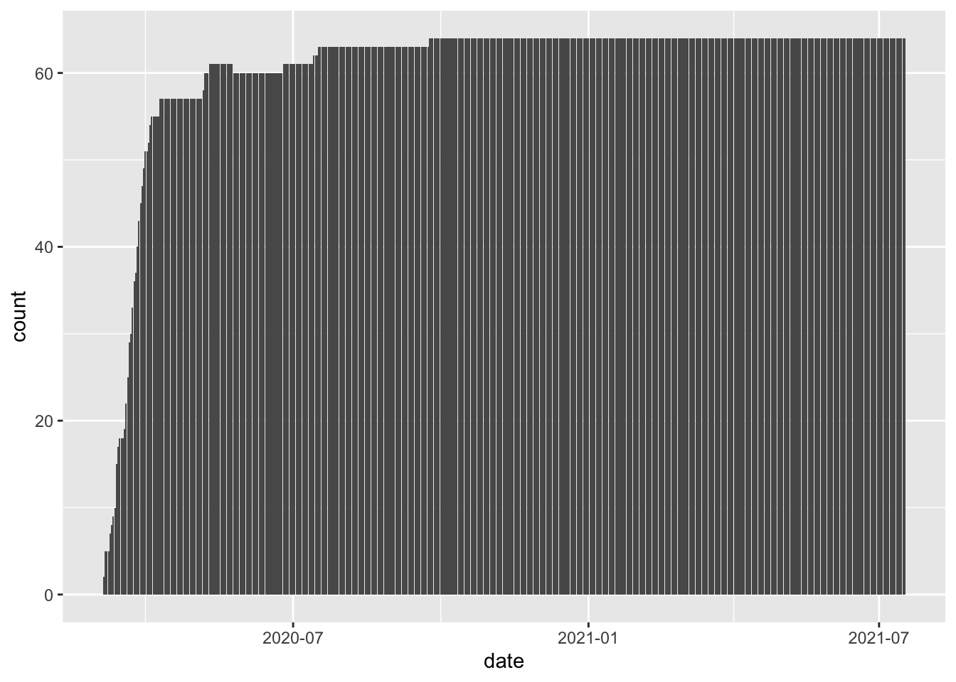
We can make the plot a bit “prettier” (to my eye at least) by changing the theme and adding a title.
ggplot(colo_covid, aes(x=date)) +
  geom_bar() +
  theme_classic() +
  ggtitle("COVID-19 Observations in Colorado Counties by Day") +
  labs(x="Date", y="Number of Observations")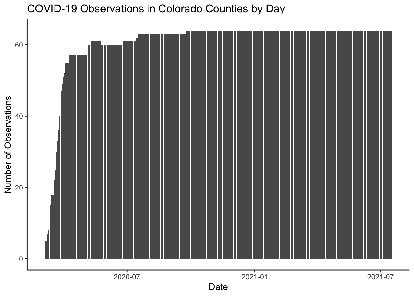
You Try It!
Now, I want you to try making a bar plot to see how many observations each county has.
We could also make bar graphs by plotting the mean of some variable by some other variable. For example, we might want to plot the average weekly salary by urban-rural context from the colo data object. Here
ggplot(colo, aes(x=urban_rural, y=wkly_wage)) +
  stat_summary(geom="bar", fun=mean) +
  theme_classic() +
  labs(x="", y="Average Weekly Wage")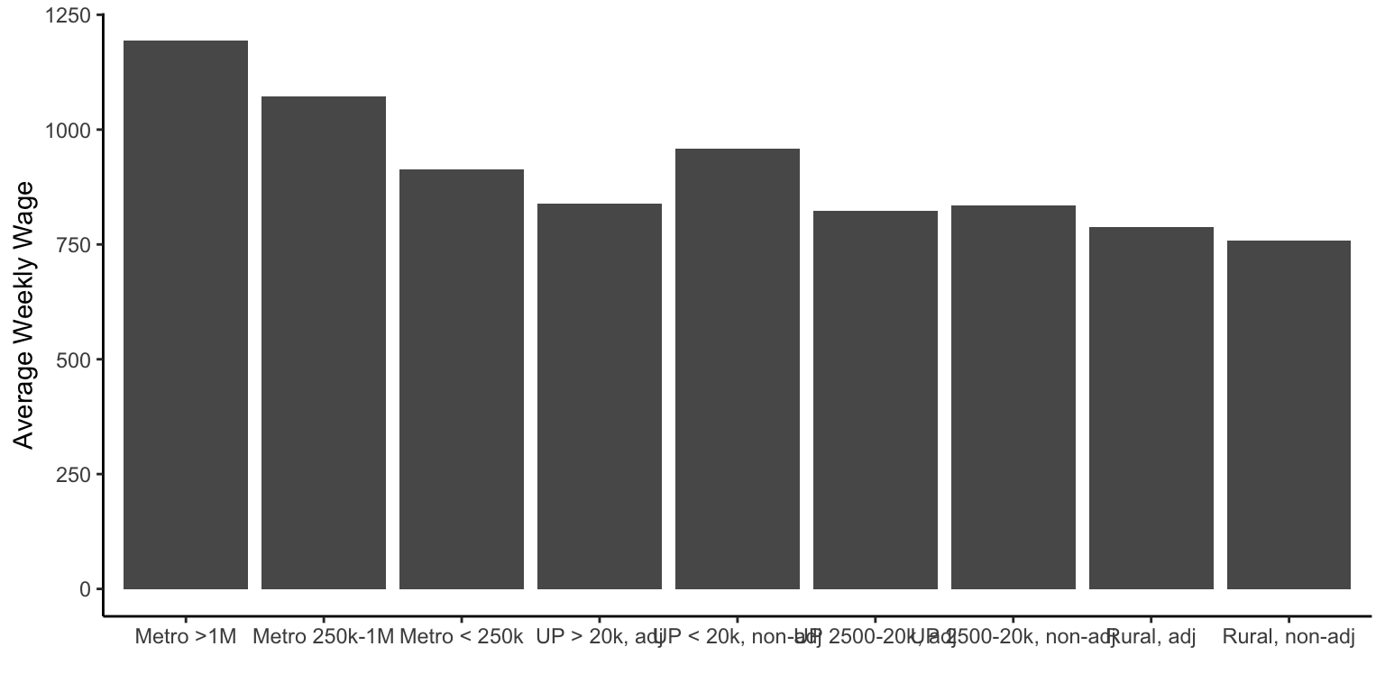
You’ll notice in the above that the labels can over-plot each other. You could solve this by making the graph wider or by flipping the \(x\)- and \(y\)- axes. You could do that with the coord_flip() function
ggplot(colo, aes(x=urban_rural, y=wkly_wage)) +
  stat_summary(geom="bar", fun=mean) +
  theme_classic() +
  labs(x="", y="Average Weekly Wage") +
  coord_flip()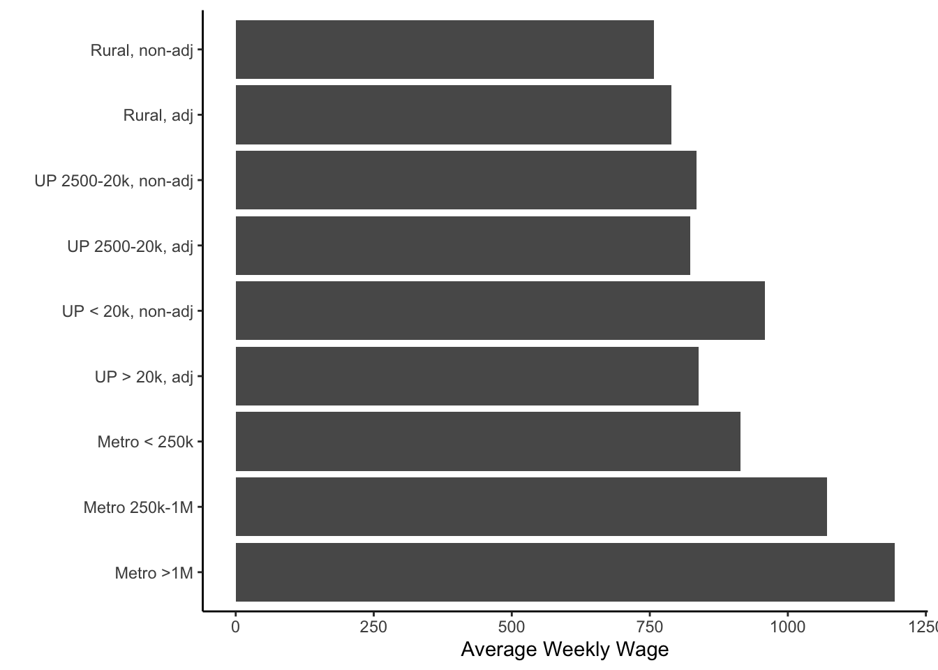
Now, one last thing that we might want to do would be to order the bars by height. We could do this with the reorder() function - applied to the x aesthetic in the call to ggplot().
ggplot(colo, aes(x=reorder(urban_rural, wkly_wage, mean),
                 y=wkly_wage)) +
  stat_summary(geom="bar", fun=mean) +
  theme_classic() +
  labs(x="", y="Average Weekly Wage") +
  coord_flip()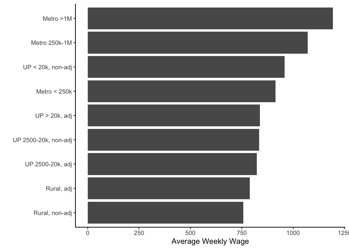
You Try It!
Now you can make a bar plot of average republican vote by urban-rural context. Make sure to sort by height.
If we wanted to see the actual data instead, we could use the summarise() function from the dplyr package.
colo %>%
  group_by(urban_rural) %>%
  summarise(mean_wage = mean(wkly_wage)) %>%
  arrange(-mean_wage)
## # A tibble: 9 x 2
## urban_rural mean_wage
## <fct> <dbl>
## 1 Metro >1M 1194.
## 2 Metro 250k-1M 1072.
## 3 UP < 20k, non-adj 959
## 4 Metro < 250k 914
## 5 UP > 20k, adj 838.
## 6 UP 2500-20k, non-adj 834.
## 7 UP 2500-20k, adj 823.
## 8 Rural, adj 789.
## 9 Rural, non-adj 758.1.2.2 Merging Datasets
Next, we could go ahead and put our two datasets together. First, though, we can use some of the information from above to help us out. We saw that not every date had the same number of observations (nor did every county). Ultimately what we want is a complete, balanced dataset of cases. The first thing we’ll do is mark the original observations in our dataset with a 1.
colo_covid<- colo_covid %>%
  mutate(orig = 1)
Next, we’ll try to complete the dataset using the tidyr package. The complete() function allows us to do this:
library(tidyr)
colo_covid2 <- colo_covid %>%
  complete(county, nesting(date)) %>%
  group_by(county) %>%
  mutate(fips = last(fips)) %>%
  filter(county != "Unknown") %>%
  select(-state)
We can fill in the missing values on cases and deaths with zero.
colo_covid2 <- colo_covid2 %>%
  mutate(cases = ifelse(is.na(cases), 0, cases),
         deaths = ifelse(is.na(deaths), 0, deaths))
Finally, we can put the two datasets together. The left_join() function will keep all of the rows of the first argument and only the matching elements of the second dataset. right_join() does the opposite. There are also full_join() which keeps all elements of both datasets and inner_join() which keeps on the elements present in both datasets.
Just by way of information, there are also some filter-join functions in the dplyr package. semi_join() returns the rows of its first argument that exist in its second argument and anti_join() returns the rows of its first argument that do not exist in its second argument.
colo_dat <- colo %>%
  select(-fips, -st, -cases, -deaths) %>%
  left_join(colo_covid2, .)
colo_dat
## # A tibble: 32,000 x 46
## # Groups: county [64]
## county date fips cases deaths orig hospitals icu_beds tpop mpop fpop white_male
## <chr> <date> <int> <dbl> <dbl> <dbl> <int> <int> <dbl> <dbl> <dbl> <dbl>
## 1 Adams 2020-03-05 8001 0 0 NA 3 168 1023736 0.505 0.495 0.434
## 2 Adams 2020-03-06 8001 0 0 NA 3 168 1023736 0.505 0.495 0.434
## 3 Adams 2020-03-07 8001 0 0 NA 3 168 1023736 0.505 0.495 0.434
## 4 Adams 2020-03-08 8001 0 0 NA 3 168 1023736 0.505 0.495 0.434
## 5 Adams 2020-03-09 8001 0 0 NA 3 168 1023736 0.505 0.495 0.434
## 6 Adams 2020-03-10 8001 0 0 NA 3 168 1023736 0.505 0.495 0.434
## 7 Adams 2020-03-11 8001 0 0 NA 3 168 1023736 0.505 0.495 0.434
## 8 Adams 2020-03-12 8001 2 0 1 3 168 1023736 0.505 0.495 0.434
## 9 Adams 2020-03-13 8001 3 0 1 3 168 1023736 0.505 0.495 0.434
## 10 Adams 2020-03-14 8001 6 0 1 3 168 1023736 0.505 0.495 0.434
## # … with 31,990 more rows, and 34 more variables: white_female <dbl>, white_pop <dbl>,
## # black_male <dbl>, black_female <dbl>, black_pop <dbl>, hisp_male <dbl>, hisp_female <dbl>,
## # hisp_pop <dbl>, over60_pop <dbl>, over60_male <dbl>, over60_female <dbl>, lt25k <dbl>,
## # gt100k <dbl>, nohs <dbl>, BAplus <dbl>, repvote <dbl>, urban_rural <fct>, tot_pop <int>,
## # full_vac_pop <int>, pct_vac_pop <dbl>, eligible_pop <int>, full_vac_eligible <int>,
## # pct_vac_eligible <dbl>, adult_pop <int>, full_vac_adult <int>, pct_vac_adult <dbl>,
## # over65_pop <int>, full_vac_over65 <int>, pct_vac_over65 <dbl>, phys_health <dbl>,
## # mental_health <dbl>, smoking_pct <dbl>, inactivity <dbl>, wkly_wage <dbl>1.2.3 Line Graphs
Now that our two datasets are together, we could make some more graphs. We could make line-graphs of cases. First, we could show how the total number of cases looks across counties.
ggplot(colo_dat, aes(x=date, y=cases)) +
  stat_summary(fun=sum, geom="line") +
  theme_classic() +
  labs(x="Date", y="Average COVID-19 Cases")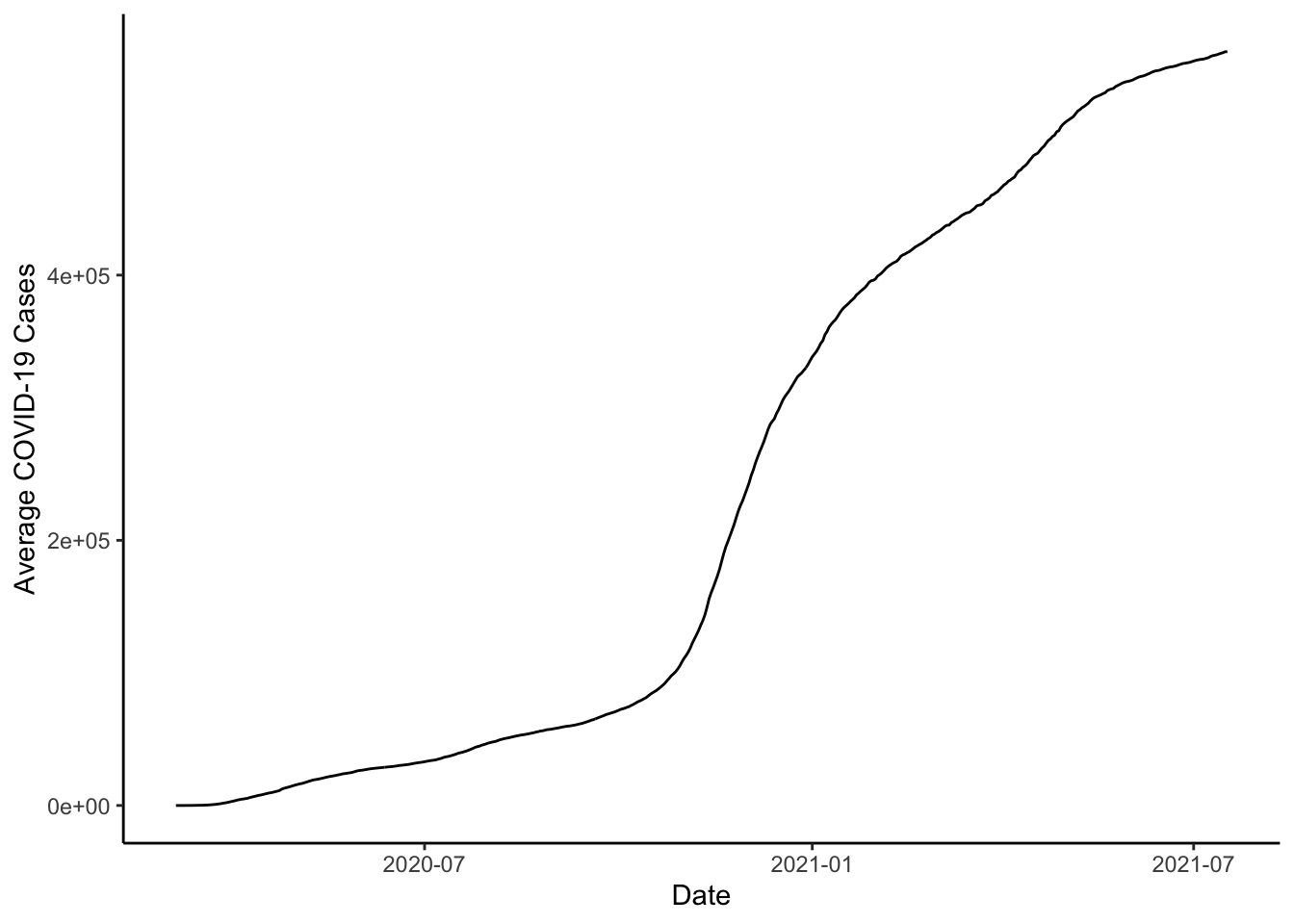
Note that cases in the dataset is the number of cases to date - a cumulative sum. If we wanted to figure out how many new cases happened each day, we could subtract the previous day’s total form the current day. We could do this with the lag() function.
colo_dat <- colo_dat %>%
  group_by(county) %>%
  arrange(county, date) %>%
  mutate(new_cases = cases - dplyr::lag(cases))
Then, we could plot the sum of new_cases by date.
ggplot(colo_dat, aes(x=date, y=new_cases)) +
  stat_summary(fun=sum, geom="line") +
  theme_classic() +
  labs(x="Date", y="Average COVID-19 Cases")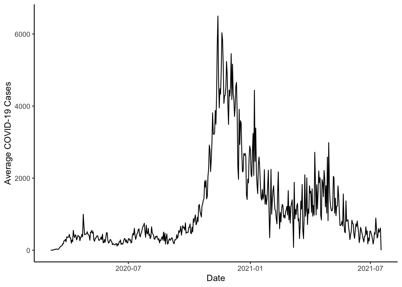
You Try It!
Now, I want you to try doing the same thing with the deaths variable.
We could also put a smooth trend line in the data with the geom_smooth() function. For this to work, though, we would need to actually make the summary data.
colo_dat %>%
  group_by(date) %>%
  mutate(new_cases = sum(new_cases, na.rm=TRUE)) %>%
ggplot(aes(x=date, y=new_cases)) +
  geom_line(col="gray50") +
  geom_smooth(col="red", size=1) +
  theme_classic() +
  labs(x="Date", y="Average COVID-19 Cases")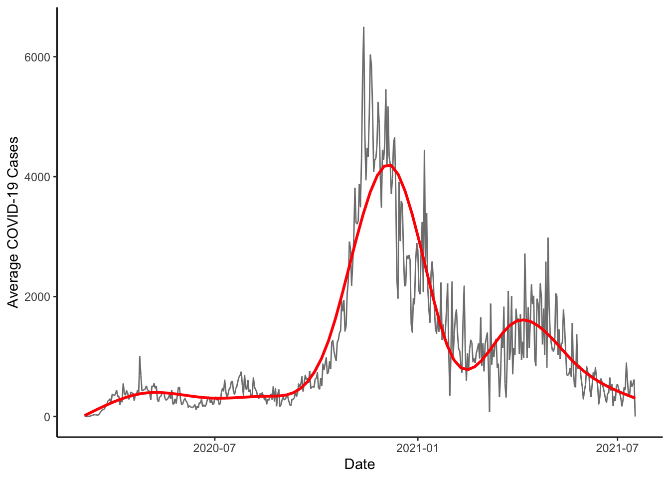
You Try It!
Now, you do the same thing with the deaths variable.
What if we wanted to plot the three worst counties in Colorado? Here we would first have to define “worst.” Let’s say for our purposes that we mean total number of cases on the last recorded day. We could then figure out the cases on the last day with the last() operator. We could also figure use the top_n() function to find the top
worst_cases <- colo_dat %>%
  group_by(county) %>%
  summarise(last_cases = last(cases)) %>%
  select(last_cases) %>%
  top_n(5) %>%
  pull

colo_dat %>%
  group_by(county) %>%
  mutate(last_cases = last(cases)) %>%
  filter(last_cases %in% worst_cases) %>%
  ggplot(aes(x=date, y=cases, colour=county)) +
    geom_line() +
    theme_classic() +
    theme(legend.position="top") +
    labs(x="Date", y="COVID-19 Cases", colour="")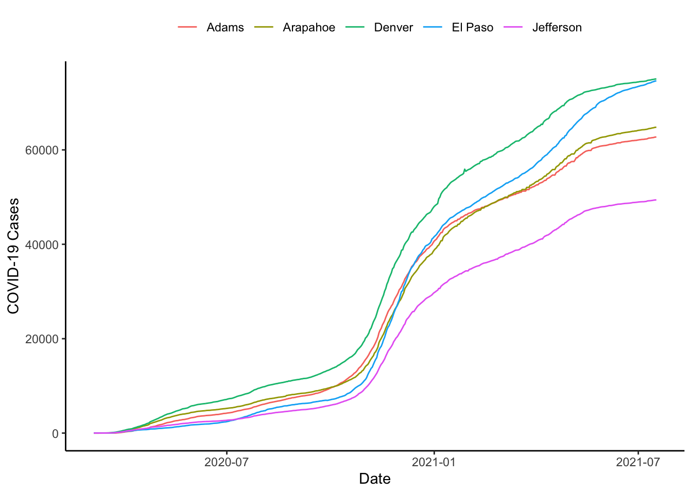
It looks like things are pretty stable until say March 15 or so, why don’t we start then. The xlim() function allows us to do this.
colo_dat %>%
  group_by(county) %>%
  mutate(last_cases = last(cases)) %>%
  filter(last_cases %in% worst_cases) %>%
  ggplot(aes(x=date, y=cases, colour=county)) +
    geom_line() +
    theme_classic() +
    xlim(ymd("2020-03-15"), ymd("2021-07-19")) +
    theme(legend.position="top") +
    labs(x="Date", y="COVID-19 Cases", colour="")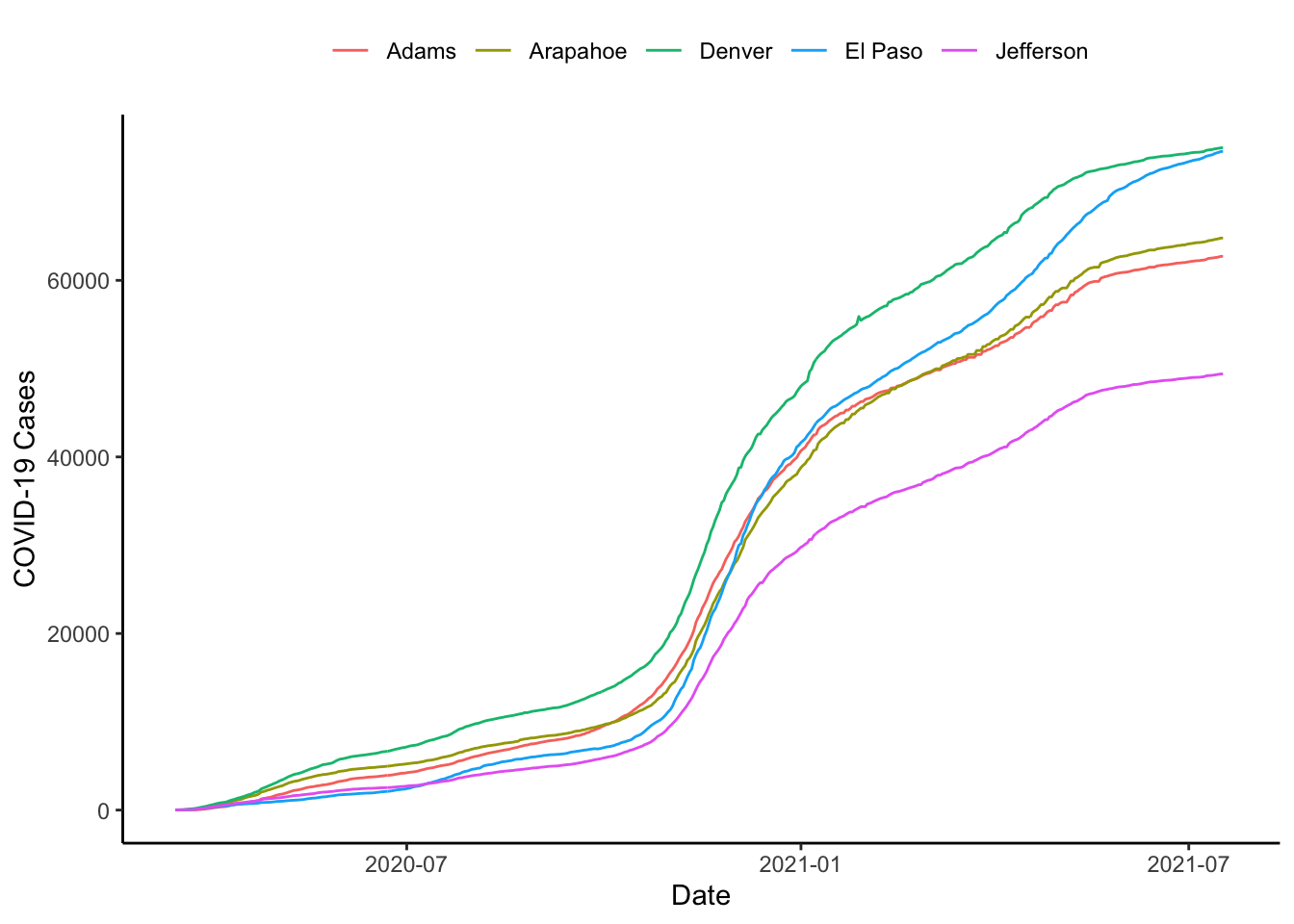
Or, we could do it with the scale_x_continuous() function, can be used to impose exact limits on the plotting region by setting expand=c(0,0) as below.
colo_dat %>%
  group_by(county) %>%
  mutate(last_cases = last(cases)) %>%
  filter(last_cases %in% worst_cases) %>%
  ggplot(aes(x=date, y=cases, colour=county)) +
    geom_line() +
    theme_classic() +
    theme(legend.position="top") +
    scale_x_date(limits=c(ymd("2020-03-15"), ymd("2021-07-19")),
                 expand=c(0,0)) +
    labs(x="Date", y="COVID-19 Cases", colour="")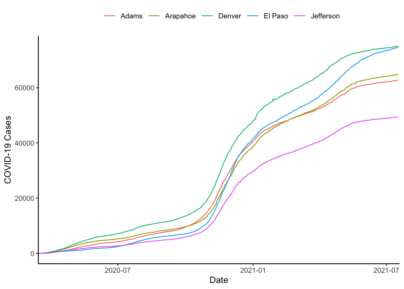
colo_dat %>%
  group_by(county) %>%
  mutate(last_cases = last(cases)) %>%
  filter(last_cases %in% worst_cases) %>%
  ggplot(aes(x=date, y=cases, colour=county)) +
    geom_line(show.legend = FALSE) +
    theme_classic() +
    scale_y_continuous(
      sec.axis = sec_axis(~.,
                          breaks=worst_cases+c(0,0,0, -100, 0),
                          labels = c("Denver", "Arapahoe",
                                     "Adams", "El Paso",
                                     "Jefferson"))) +
    theme(legend.position="top") +
    scale_x_date(limits=c(ymd("2020-03-15"), ymd("2021-07-19")),
                 expand=c(0,0)) +
    labs(x="Date", y="COVID-19 Cases", colour="")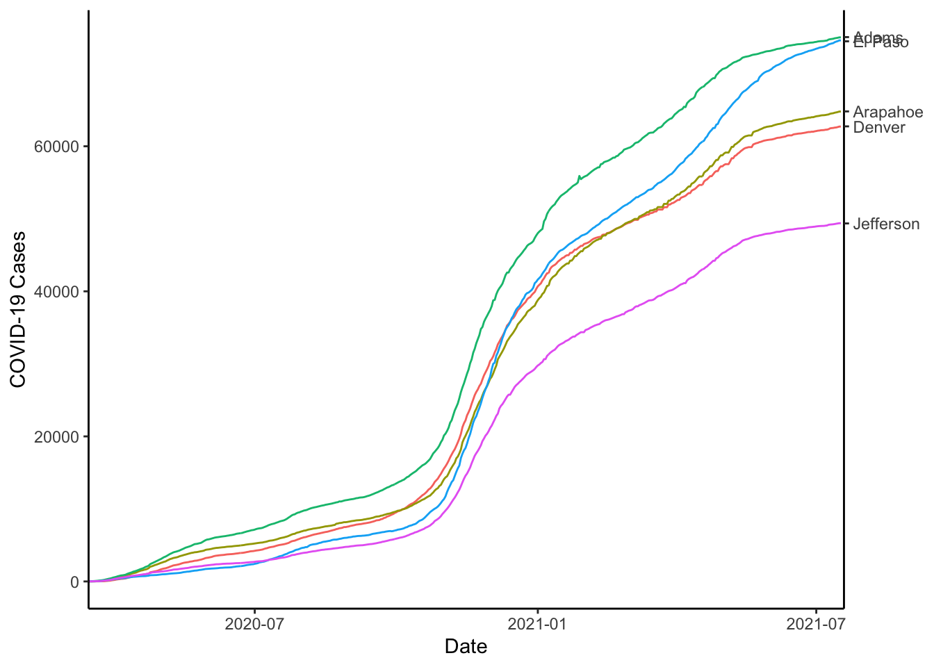
Sometimes the text overplots, to solve this, you could use the geom_text_repel() function from the {ggrepel} package. For this to work, we will need to do a couple of other things. First, we will need to use coord_cartesian() to set the x-limits wide enough to include the labels. Then, we will need to use scale_x_date() to make sure that only the dates we want are printed on the x-axis.
library(ggrepel)
colo_dat %>%
  group_by(county) %>%
  mutate(last_cases = last(cases),
         last_date = last(date),
         lab = ifelse(date == last_date, county, NA)) %>%
  filter(last_cases %in% worst_cases) %>%
  ggplot(aes(x=date, y=cases, colour=county)) +
  geom_line(show.legend = FALSE) +
  theme_classic() +
  scale_x_date(breaks=c(ymd("2020-07-01"), ymd("2021-01-01"),
                        ymd("2021-07-01"))) +
  geom_text_repel(aes(label = lab), show.legend = FALSE,
                  nudge_x = 50) +
  coord_cartesian(xlim = c(ymd("2020-03-15"), ymd("2021-12-01")),
                  ylim=c(0,80000)) +
  labs(x="Date", y="COVID-19 Cases", colour="")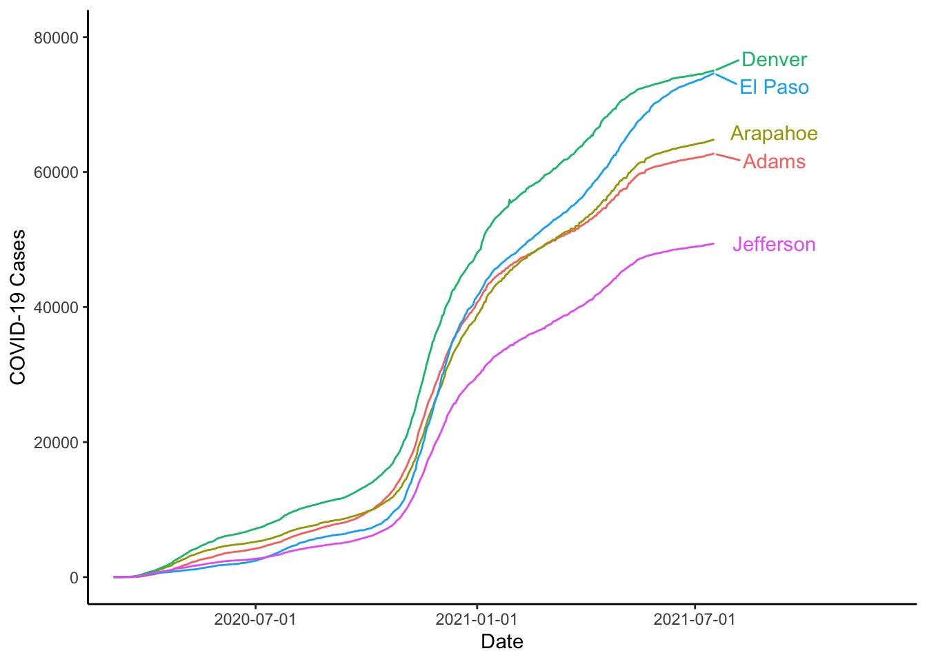
You Try It!
You make the same kind of graph, but get the 4 worst counties with respect to the deaths variable.
1.2.3.1 Controlling Colour
We can change the colours of lines with the scale_colour_manual() function. The first argument is values which has to be a vector of colours. There is also an optional labels argument that would allow you to overrided the default labels attached to the colours.
If you’re looking for resources for choosing colours, here are a couple that might be useful
- Colorbrewer is a website that is specifically designed for mapping colors, but the palettes are general enough to be used for anything. All of the palettes are implemented in the
RColorBrewerpackage. - Paletton is not a fancy exercise bike, but a website that helps you pick colour palettes. If you find one you like, there is a “Tables/Export” button right below the colour swatches. If you click that, it will tell you the hex codes for the colours that you can use in R.
Looking at the ColorBrewer website, we let’s say we wanted to use the “Set1” palette. We could do that as follows:
library(RColorBrewer)
colo_dat %>%
  group_by(county) %>%
  mutate(last_cases = last(cases),
         last_date = last(date),
         lab = ifelse(date == last_date, county, NA)) %>%
  filter(last_cases %in% worst_cases) %>%
  ggplot(aes(x=date, y=cases, colour=county)) +
  geom_line(show.legend = FALSE) +
  theme_classic() +
  scale_colour_manual(values=brewer.pal(5, "Set1")) +
  scale_x_date(breaks=c(ymd("2020-07-01"), ymd("2021-01-01"),
                        ymd("2021-07-01"))) +
  geom_text_repel(aes(label = lab), show.legend = FALSE,
                  nudge_x = 50) +
  coord_cartesian(xlim = c(ymd("2020-03-15"), ymd("2021-12-01")),
                  ylim=c(0,80000)) +
  labs(x="Date", y="COVID-19 Cases", colour="")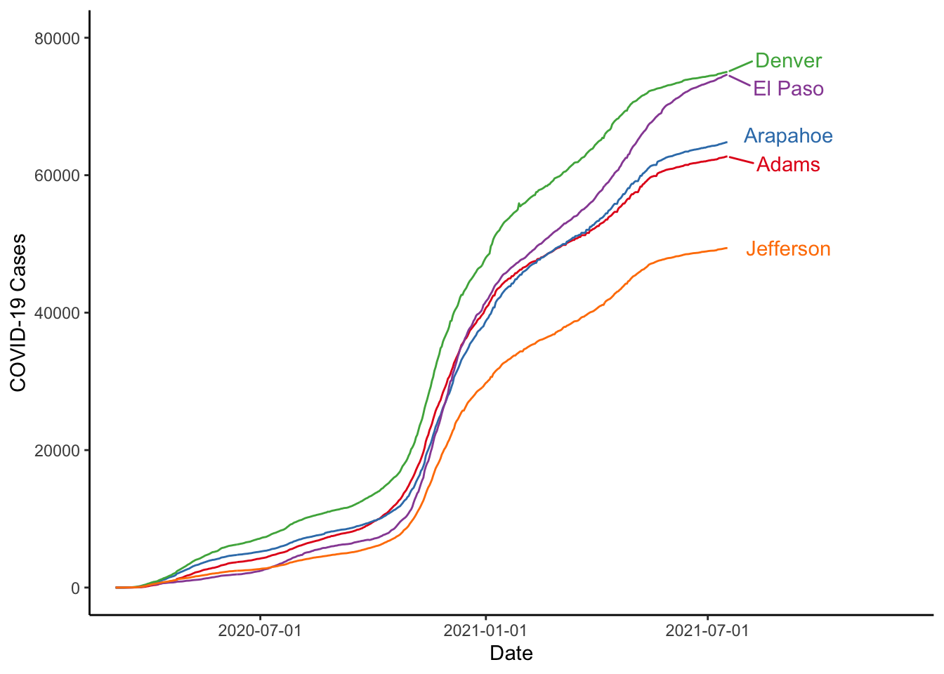
You Try It!
Implement a new colour scheme in your plot of the worst places in Colorado with respect to deaths.
We could move back and plot all of the lines on the same graph. Doing this, we probably don’t want to colour them differently. We would rather have them look all the same to identify the overall patterns. We could also put in a line for the mean with the stat_summary() function and we could even change the scale of \(y\) to be log10 instead of in the level. Note that the group aesthetic is defined for the line geometry, but not for the whole plot. To define it for the whole would calculate the mean of cases by day within each county. Putting the group aesthetic in the line geometry means that it only affects the drawing of these lines and not the line drawn by stat_summary().
ggplot(colo_dat, aes(x=date, y=cases+1)) +
  geom_line(aes(group=county), col="gray65", size=.5) +
  stat_summary(fun=mean, col="red", geom="line") +
  theme_classic() +
  scale_x_date(limits=c(ymd("2020-03-15"), ymd("2021-07-19")),
               expand=c(.01,.01)) +
  scale_y_log10() +
  labs(x="Date", y="COVID-19 Cases", colour="")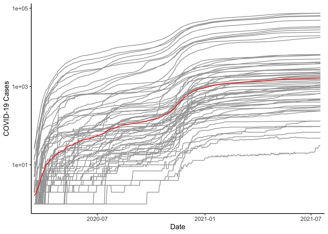
You Try It!
Now, you do the same as above, but for deaths.
1.2.4 Histograms
We can move to talk about histograms. We could look at the distribution of case-counts on the most recent day. The most straightforward way would be to subset the data and then make the graph of the subset data.
colo_dat %>%
  filter(date == max(date)) %>%
  ggplot(aes(x=cases)) +
    geom_histogram() +
    theme_classic() +
    labs(x="COVID-19 Cases")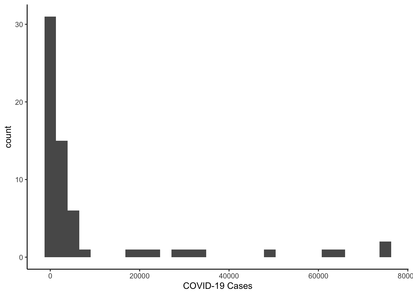
Since the distribution is skewed, we could make a histogram of the log of cases.
library(scales)
colo_dat %>%
  filter(date == max(date)) %>%
  ggplot(aes(x=cases+1)) +
    geom_histogram() +
    scale_x_log10(label=comma) +
    theme_classic() +
    labs(x="COVID-19 Cases")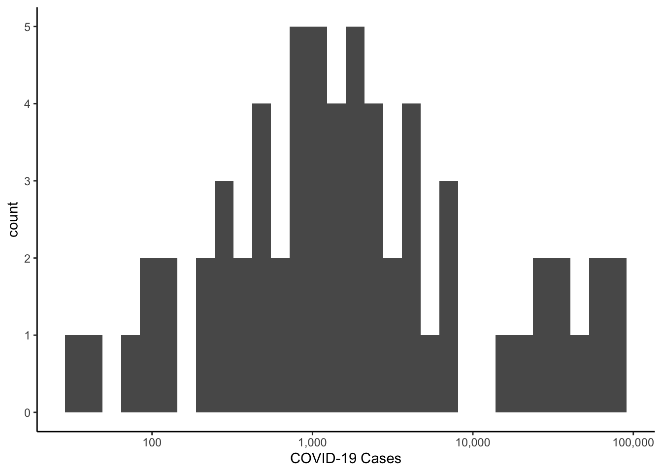
You Try It!
Find a variable or two in the data and make a histogram of its distribution. Note that the bins=# argument to the histogram geometry will produce a histogram with # bins.
To make things a bit more interesting, let’s make a new variable that codes whether a majority of the two-party vote went to the republican or note. There is a recode() function in the dplyr package, but it’s not actually the best one. I have always like the one in the car pacakge better.
1.2.4.1 Package masking
This brings up an important point to think about. When we load two packages that have functions of the same name in them, the more recent one loaded masks the more distant one loaded. In this case, we have been using the dplyr functions quite extensively and we just want to use one function from the car package. Rather than using library(car) and then specifying the recode function and hoping that car was loaded after dplyr, we can be explicit about where we want R to find the function. We can cal car::recode() instead. This tells R to get the recode() function from the car package. The two colons :: mean get a function that is exported from the namespace. Let’s talk about these two terms for a second.
When people build packages for R, it creates a namespace that contains all of the functions that exist in the package. This is, for example, so functios inside the car package can easily access other functions inside the car package.
Some, and sometimes all, of the functions that people write in a package are exported - meaning that they are intended to be called directly by end users. Some functions, however, may not be exported - specifically those that are intended to be called by other functions within the package, but not by the end users directly. The two colons can retrieve functions from that namespace that are exported. Three colons ::: can retrieve any function from the namespace, whether or not it was exported by the end user. These can be useful if you want to make sure you’re always using the right version of a function that you know often gets masked.
As more and more packages are written for R, this is more and more likely to happen. There are a few that happen regularly for things that I do. The aforementioned recode() function is one (both in car and dplyr), but so is the select() function, which is in both the MASS package and dplyr.
1.2.4.2 Recoding Variables
We will recode the values of repvote such that values less than or equal to 50 are coded as “Democratic Majority” and values greater than 50 is coded as “Republican Majority.” If we had any values that were exactly \(50%\), we might want to include a category for ties, but we don’t have that here. The first argument to the recode() function is a vector of values to be recoded. The second is a set of recode instructions with the following properties:
- The entire set of recode instructions must be inside a single set of quotations (either single quotes or double quotes).
- Each individual recode instruction is separated from the next by a semicolon (
;).
The recode instructions take the form of old-values = new-value, where old-values can be a scalar (e.g., 2=1), vector (e.g., c(1,2,3)=0) or range (e.g., 1:4 =0). The range operator (:) works differently in the recode function than it does in the rest of R. In the rest of R, it creates sequences of integer values between the number on the left of the colon to the number on the right:
1:5## [1] 1 2 3 4 5However in the recode() function, it means all values between the number on its left and the number on its right, inclusive of the bounds. For ranges, there are a couple of “helper” values: lo and hi fill in for the lowest and highest values in the variables without having to identify the numbers directly.
The result can be returned as a factor (if you supply the argument as.factor=TRUE) and if you do that, you can also set the ordering of the levels with the levels argument. Here, the levels have to be spelled exactly as they are in the recode instructions. As discussed in the Data Types in R section, the first value of a factor will serve as the reference category in models. Below, we put all of these pieces together.
colo_dat <- colo_dat %>%
  mutate(maj_party = car::recode(repvote,
                                 "lo:.5='Democratic'; .5:hi='Republican'",
                                 as.factor=TRUE,
                                 levels=c("Democratic", "Republican")))
Note that above, .5 is the upper bound of the first recode statement and the lower bound of the second. We don’t actually have any values of exactly 0.5, but if we did, those values would go into the Democratic catetory. It’s the first recode statement involving a number that is operative.
An alternative way of doing this is with the case_when() function from the {dplyr} package.
colo_dat <- colo_dat %>%
  mutate(maj_party = case_when(
          repvote < 0.5 ~ "Republican",
          repvote > .5 ~ "Democrat",
          TRUE ~ NA_character_),
        maj_party = as.factor(maj_party))
Now, we could go back to make our histogram of the log of cases conditioning on majority vote. There are generally two methods of plotting multiple groups - superposition and justaposition. We’ve already seen superposition at work in the graphs above with multiple lines.
- In superposed graphs, multiple groups are plotted in the same plotting region (we might call it a “panel”). We saw this above when we had different coloured lines where each group is represented as a different colour. The aesthetic elements
size,shape,linetype,colour- all represent methods for identifying superposed series. - In juxtaposed graphs, each group is plotted in its own panel. Colours are not needed because each panel contains only a single series and the group is identified in the strip above the panel. This is done with either the
facet_wrap()orfacet_grid()function in R.
First, let’s do the juxtaposed plot of most recently recoded cases.
colo_dat %>%
  group_by(county, maj_party) %>%
  summarise(last_cases = last(cases)) %>%
  ggplot(aes(x=last_cases)) +
    geom_histogram(bins=10) +
    scale_x_log10(label = comma) +
    theme_bw() +
    theme(aspect.ratio=1,
          panel.grid = element_blank()) +
    facet_wrap(~maj_party) +
    labs(x="COVID-19 Cases")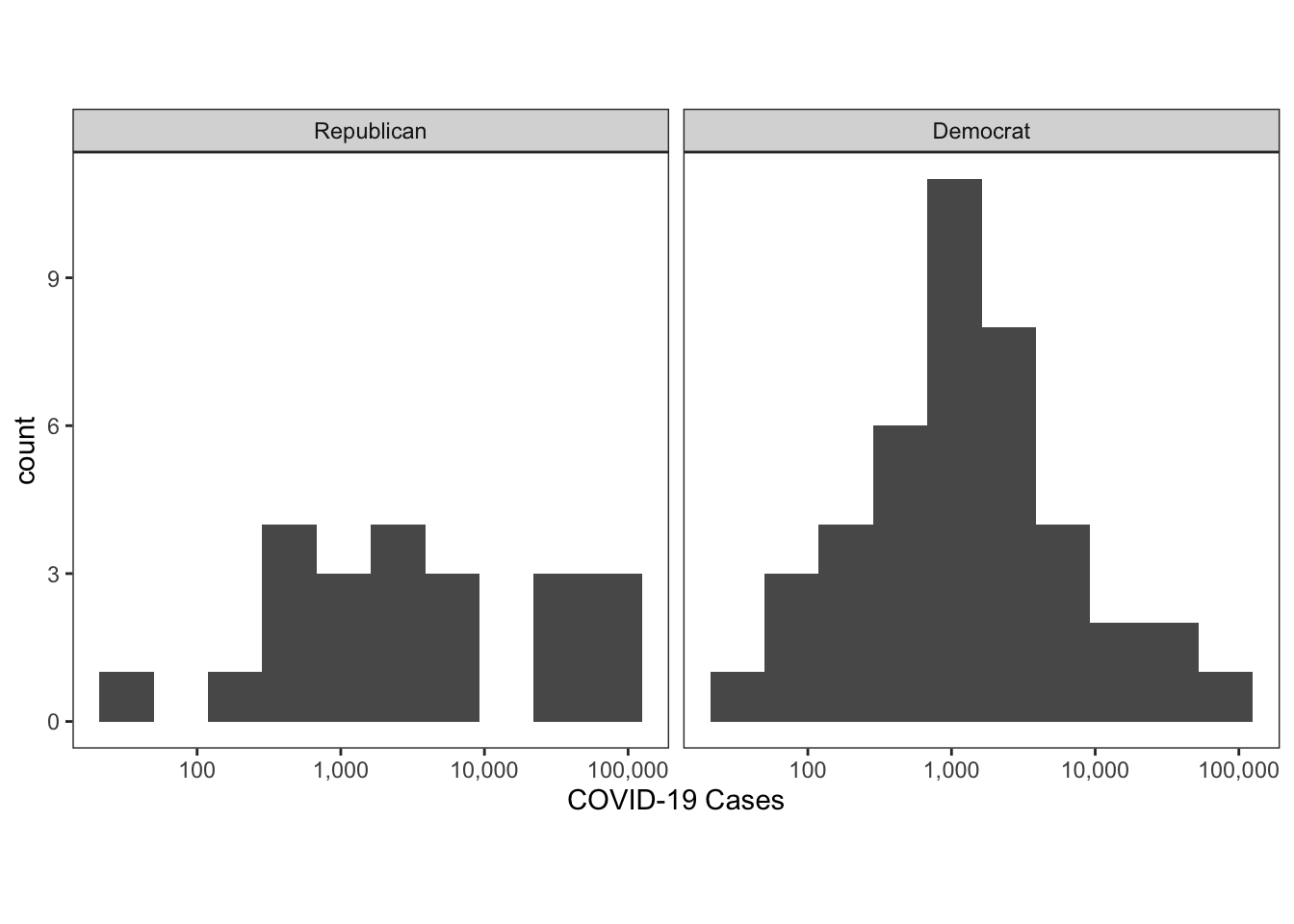
If we wanted to superpose the cases, we could do that by specifying the fill aesthetic. In the code below, we set the alpha parameter in the histogram geometry, which allows the colours to be semi-transparent. The alpha parameter ranges from 0 (completely transparent) to 1 (completely opaque).
colo_dat %>%
  group_by(county, maj_party) %>%
  summarise(last_cases = last(cases)) %>%
  ggplot(aes(x=last_cases, fill=maj_party)) +
    geom_histogram(bins=10, alpha=.3) +
    scale_x_log10(label = comma) +
    theme_classic() +
    labs(x="COVID-19 Cases")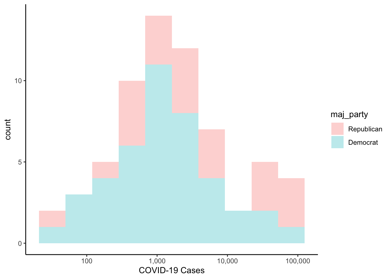
The default position of the histograms above is to stack them. That is, for each bin, the democratic values are stacked on top of the republican values. If you would rather have them each plotted starting at zero, you could use position="identity" as an argument to the histogram geometry.
colo_dat %>%
  group_by(county, maj_party) %>%
  summarise(last_cases = last(cases)) %>%
  ggplot(aes(x=last_cases, fill=maj_party)) +
    geom_histogram(bins=10, alpha=.3, position="identity") +
    scale_x_log10(label = comma) +
    theme_classic() +
    labs(x="COVID-19 Cases")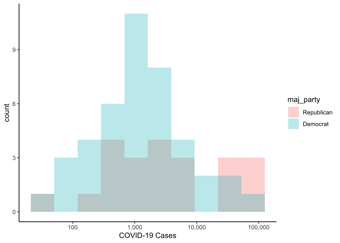
If you wanted the y-axis labels in percentages instead, you could do the following:
colo_dat %>%
  group_by(county, maj_party) %>%
  summarise(last_cases = last(cases)) %>%
  ggplot(aes(x=last_cases, fill=maj_party)) +
  geom_histogram(aes(y = ..count../sum(..count..)),
                 bins=10, alpha=.3, position="identity") +
  scale_x_log10(label = comma) +
  scale_y_continuous(label = label_percent(accuracy=1)) +
  theme_classic() +
  labs(x="COVID-19 Cases",
       y="Percentage")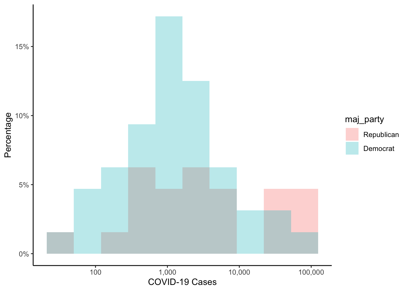
You Try It!
- Make a two-category variable from the
mental_healthvariable such that values less than or equal to 3.5 are in the “low” category and those greater than 3.5 are in the “high” category. - Make a histogram of the the
inactivityvariable by the newmental_healthcategorical variable that you made.
1.2.5 Scatterplots
Finally, for now, we’ll investigate scatterplots. We can make a scatterplot between the log of average weekly wage (wkly_wage) and the log of the most recent COVID-19 cases.
colo_dat %>%
  group_by(county) %>%
  arrange(date) %>%
  slice_tail(n=1) %>%
  ggplot(aes(x=wkly_wage, y=cases)) +
    geom_point() +
    theme_classic() +
    labs(x="Average Weekly Wage",
         y="COVID-19 Cases")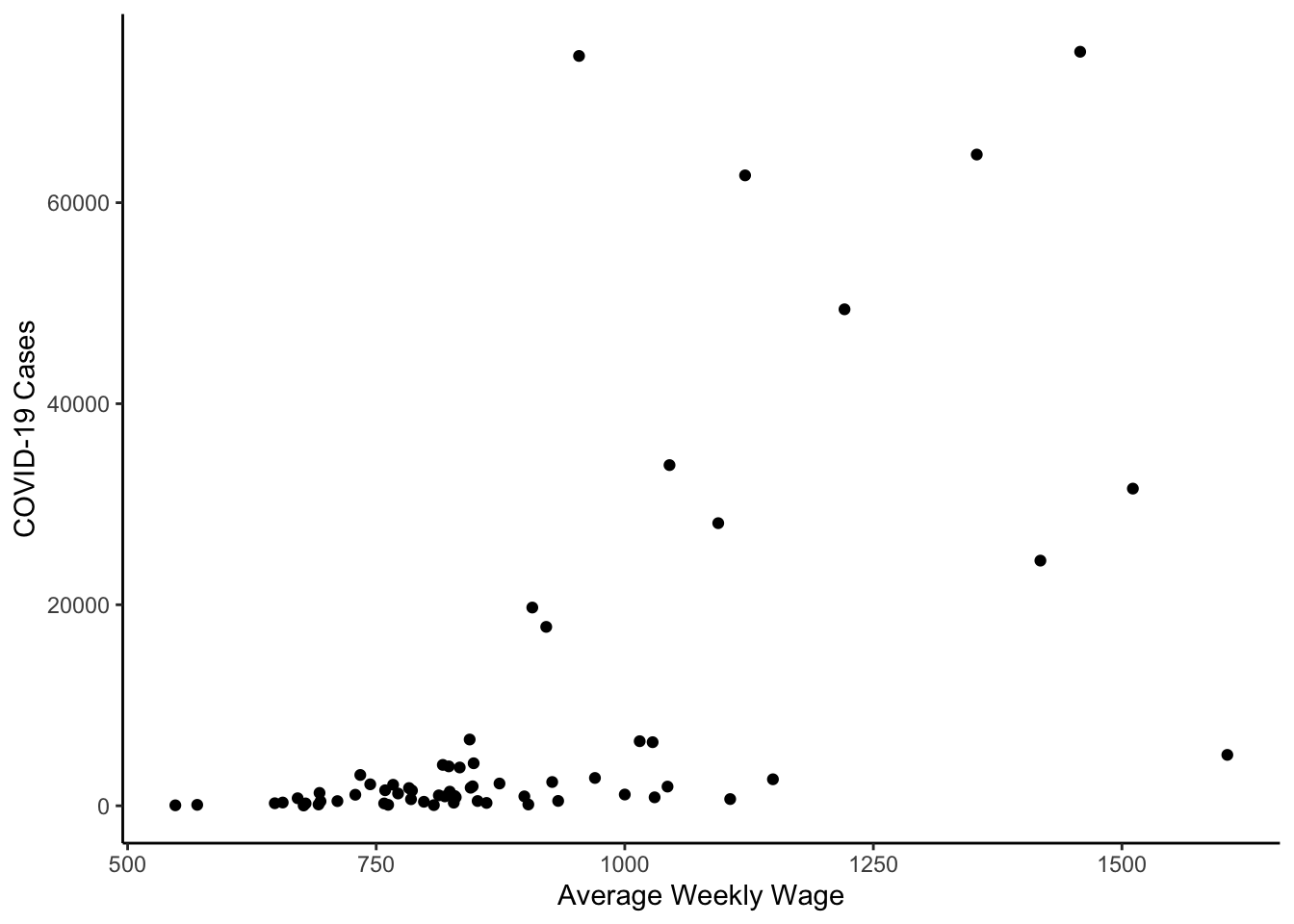
colo_dat %>%
  group_by(county) %>%
  arrange(date) %>%
  slice_tail(n=1) %>%
  ggplot(aes(x=wkly_wage, y=cases)) +
    geom_point() +
    scale_y_log10(label = comma) +
    scale_x_log10() +
    theme_classic() +
    labs(x="Average Weekly Wage",
         y="COVID-19 Cases")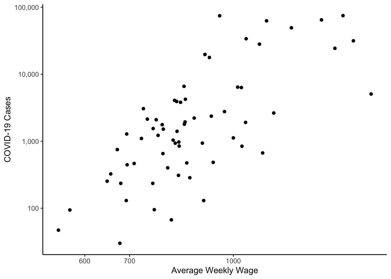
In the figure above the plotting symbol is the default filled circle. This can be changed with either pch or shape. The options are:
knitr::include_graphics("_book/RBE_files/figure-html/pch.png")
The filled symbols are fine for small datasets, but open symbols are better for larger datasets as they allow you to more easily visualize overplotting of symbols (i.e., it’s easier to see the density of data). Another option would be to set the alpha parameter to a small value - this would allow you to visualize overplotting as well.
You Try It!
- Now, you make a scatterplot of the log of the most recently reported cases against a different variable. Bonus points for adding a smooth trend line to the graph.
- Make the symbols different based on the
mental_healthcategorical variable you made before.
If you wanted text instead of points, you could add a text geometry instead of the point geometry.
colo_dat %>%
  group_by(county) %>%
  arrange(date) %>%
  slice_tail(n=1) %>%
  ggplot(aes(x=wkly_wage, y=cases)) +
    geom_text(aes(label=county)) +
    scale_y_log10(label = comma) +
    scale_x_log10() +
    theme_classic() +
    labs(x="Average Weekly Wage",
         y="COVID-19 Cases")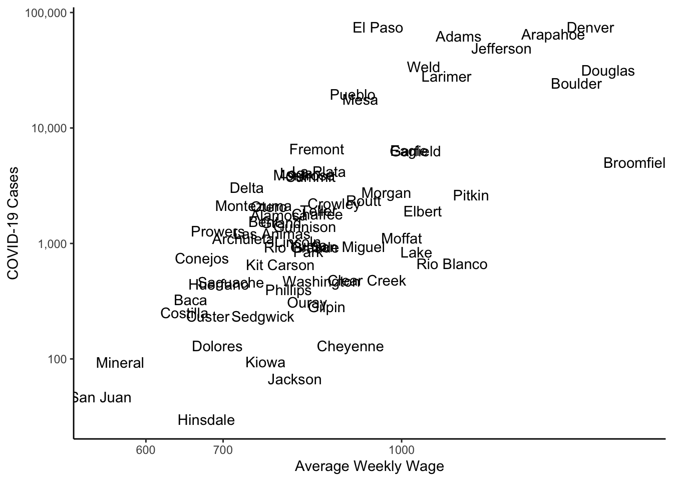
If you’re printing this for the web or you want to explore the plot yourself, you could use the plotly package, which makes interactive graphics. There is a ggplotly function that turns ggplots into interactive plotly plots. The function below will buld a plot such that when you hover over each point, it gives the county and the values of the two variables in the scatterplot.
library(plotly)
g1 <- colo_dat %>%
  group_by(county) %>%
  arrange(date) %>%
  slice_tail(n=1) %>%
  mutate(lab = paste("County: ", county, "\nCases: ", cases,
                     "\nWeekly Wage: ", wkly_wage,
                     "\nPopulation: ", tpop, sep="")) %>%
  ggplot(aes(x=wkly_wage, y=cases)) +
    geom_point() +
    scale_y_log10(label = comma) +
    scale_x_log10() +
    theme_classic() +
    labs(x="Average Weekly Wage",
         y="COVID-19 Cases")
ggplotly(g1, tooltip = "text")
You Try It!
Take one of the visualizations you made above and make it into a plotly plot.
1.2.6 Multiple Series
As a wrap-up, let’s see how we would plot both deaths and cases in the same plot. We saw how to do this earlier when we wanted to plot multiple groups for a single variable. The idea here would be the same, we simply need to transform our dataset into one where the groups represent different variables. That is, we need to reshape it from wide to long format. To do this, we can use the pivot_longer() function from the tidyr package.
tmp <- colo_dat %>%
  select(county, date, deaths, cases) %>%
  pivot_longer(cols=c("cases", "deaths"),
               names_to="var",
               values_to="val") %>%
  ungroup %>%
  group_by(date, var) %>%
  summarise(val = sum(val))
Now, we can make the plot just the way we did before. This time, however, we’ll introduce a new transformation - the inverse hyperbolic sine transformation. This is defined as
\[sinh^{-1}(x) = log(x + \sqrt{1+x^2})\]
In R, this can be done with the asinh() function. But we could actually make a function that would do the appropriate transform with a scale_y_continuous() function. The benefit here is that the IHS transform can take non-positive values, thus eliminating the need for addition of a positive constant for non-positive values.
library(scales)
asinh_trans <- function() {
  trans_new("asinh",
            transform = asinh,
            inverse   = sinh)
}ggplot(tmp, aes(x=date, y=val, colour=var)) +
geom_line() +
scale_y_continuous(trans = asinh_trans(),
breaks=c(0,1, 10, 100, 1000, 10000)) +
theme_classic() +
theme(legend.position="top") +
labs(x="Date", y="Count", colour="Series")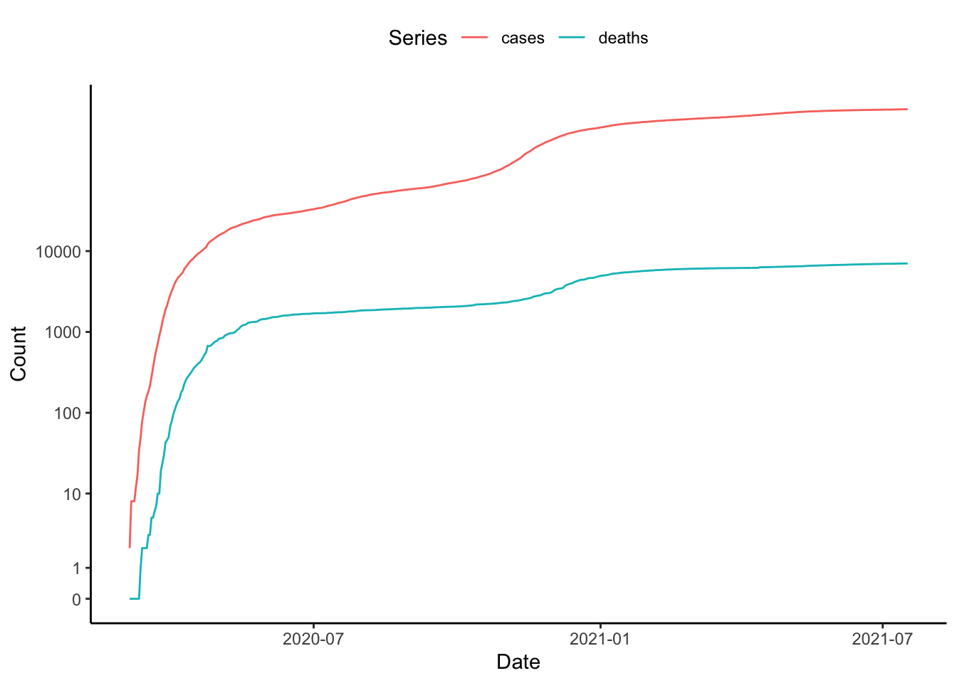
1.2.6.1 With Great Power Comes Great Responsibility
The ggplot environment makes it really easy to do lots of cool things. Just remember the important equation \(\text{Cool} + \text{Cool} + \text{Cool} \neq \text{Super Cool}\). Here’s an example.
Before we move on, we’re going to create one more categorical variable, this time out of the urban_rural variable, which is already categorical. However, we want to group all of the areas identified as “Metro” together, the areas identified as “UP” together and the areas identified as “Rural” together. We could do this with a traditional recode statement, but I thought this would be a good place to talk about how R can deal with strings. There is a really useful package called stringr which has tons of functions for string manipulation. The one we’re going to use is called str_extract() which pulls some sub-string out of a set of characters. It’s like a search and recovery mission for parts of strings. Below, we’re going to search for Metro or UP or Rural and then if it finds any of those it will extract just those bits.
library(stringr)
colo_dat <- colo_dat %>%
  mutate(mur = str_extract(urban_rural, "Metro|UP|Rural"),
         mur = factor(mur, levels=c("Rural", "UP", "Metro")))
In what’s next, we’re going to apply the last() function to a bunch of variables simultaneously with the summarise_at() function.
tmp <- colo_dat %>%
  group_by(county) %>%
  summarise(across(c(cases, repvote, wkly_wage, BAplus, mur), last))
ggplot(tmp, aes(x=wkly_wage, y=cases+1, colour=repvote, size=BAplus)) +
  geom_point() +
  geom_smooth(se=TRUE, alpha=.25, show.legend=FALSE) +
  scale_colour_viridis_c() +
  scale_x_log10() +
  scale_y_log10(label=comma) +
  facet_wrap(~mur, ncol=2) +
  theme_bw() +
  theme(aspect.ratio=1,
        panel.grid=element_blank(),
        legend.position="top") +
  labs(x="Weekly Wage",
       y="Cases",
       colour="% Republican",
       size="% BA or Higher")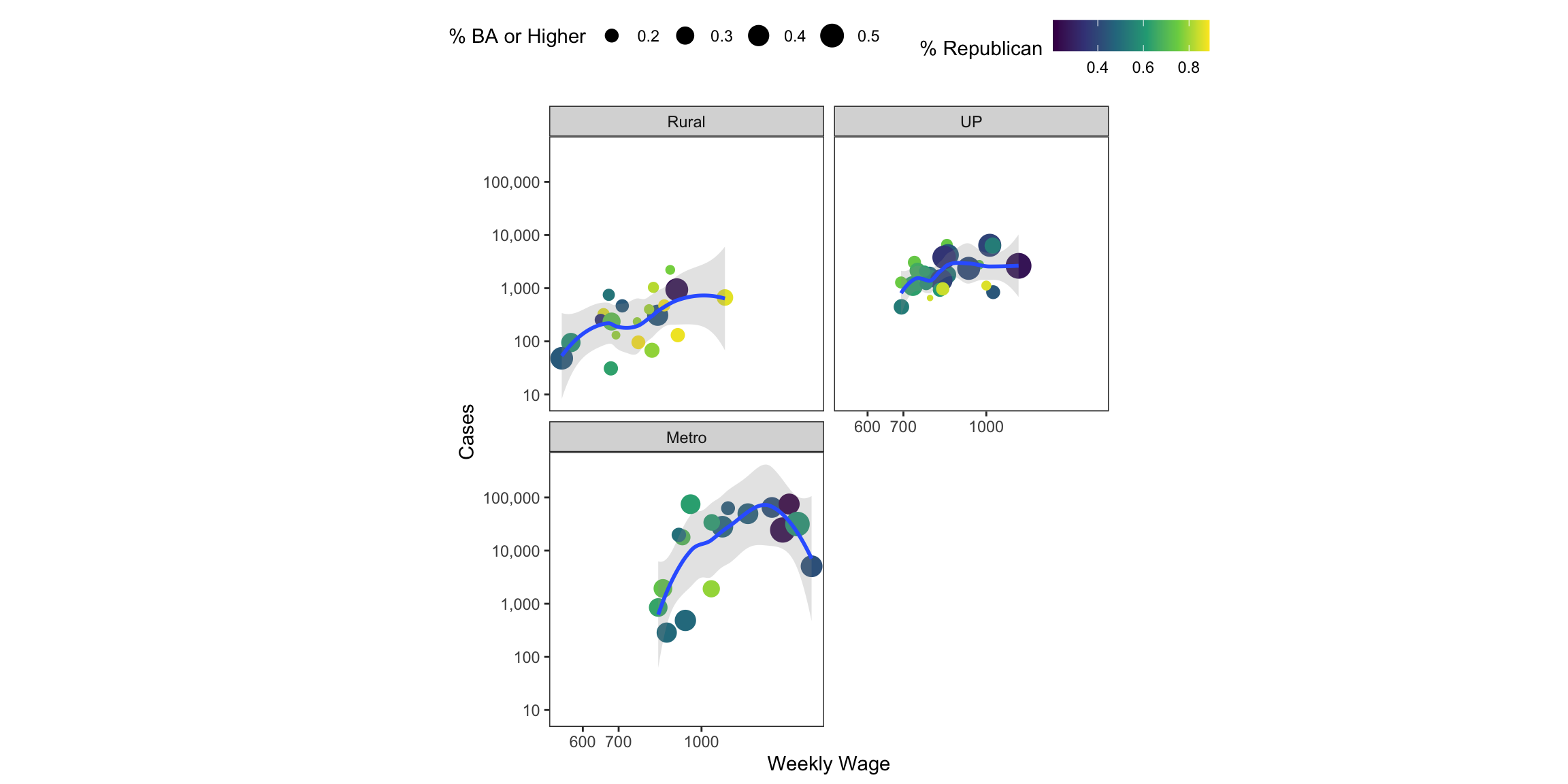
As the figure above clearly demonstrates, we can encode lots of information into geometric elements. The cognitive task of decoding all of that information is quite high. Generally, we’re not great at distinguishing different sizes of things, though with only 4 sizes, it might not be too bad. We’re also not good at making fine distinctions in color hue or saturation. Just make sure that what you’re presenting conveys the point you want to convey in the simplest possible way.
1.3 Redux
OK, so back to the main question - what do we learn about COVID-19 in Colorado? Well, given all of the tools that we’ve developed and what we know about COVID-19 infections, I think we could put together a useful visual.
I want to show deaths and cases (though in different panels). I want to group by the mur variable. Let’s do it …
colo_dat %>%
mutate(cases = cases/(tpop/100000),
deaths = deaths/(tpop/100000)) %>%
select(county, date, mur, cases, deaths) %>%
pivot_longer(cols=c("cases", "deaths"),
names_to="var",
values_to="val") %>%
ggplot(aes(x=date, y=val, colour=mur)) +
geom_line(aes(group=county), size=.25, alpha=.5) +
stat_summary(aes(group=mur), fun=median, geom="line", size=1) +
theme_classic() +
theme(legend.position="top") +
scale_y_continuous(trans = asinh_trans(), breaks=c(0,1,10,100,1000)) +
scale_colour_viridis_d() +
facet_wrap(~var, scales="free_y", ncol=1) +
labs(x="Date", y="log(Count/100k)", colour="")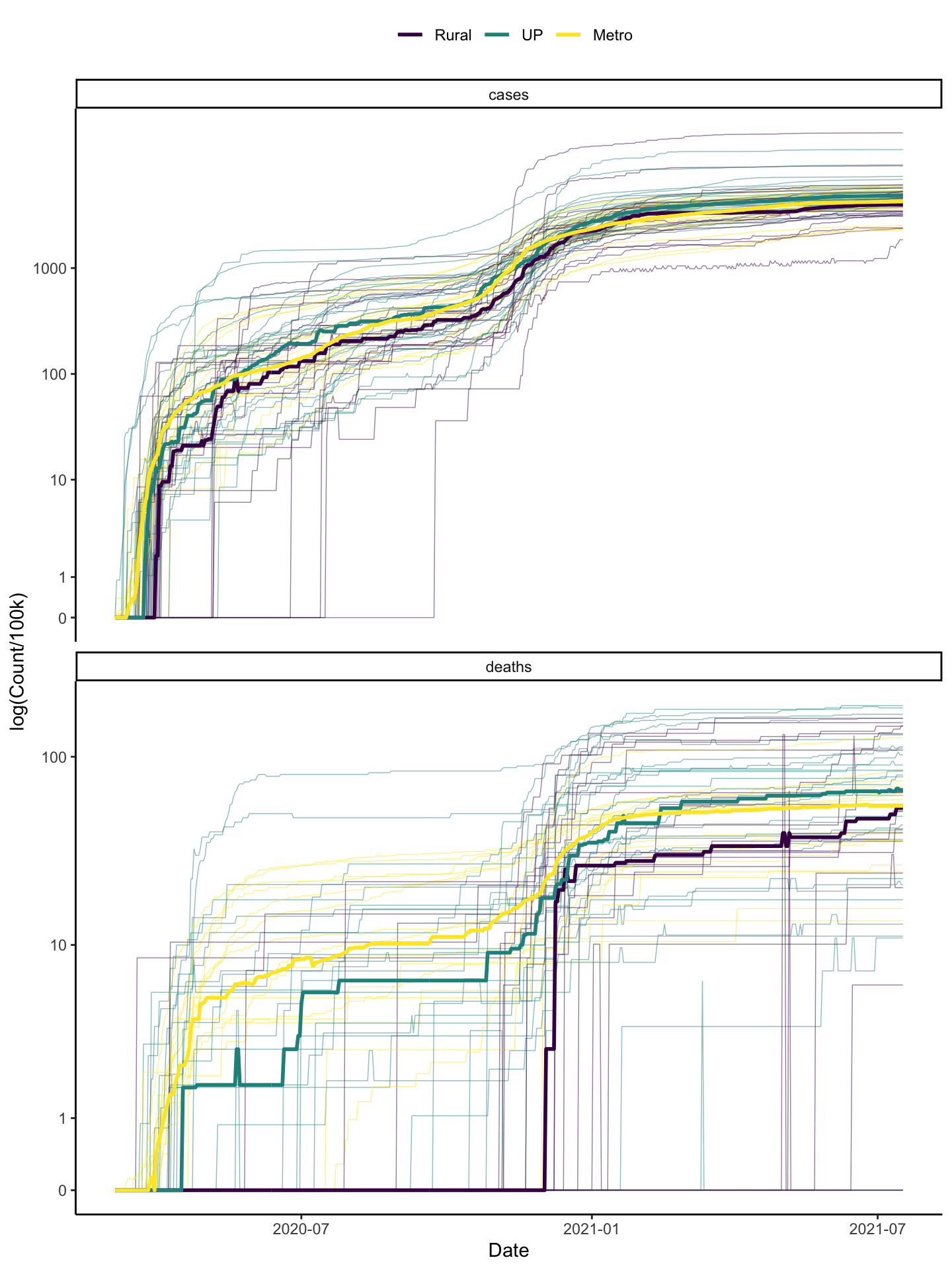 And we could also plot the death rate \(\frac{\text{deaths}}{\text{cases}}\).
colo_dat %>%
  mutate(death_rt = deaths/cases,
         death_rt = ifelse(is.finite(death_rt),
                           death_rt, 0)) %>%
  ggplot(aes(x=date, y=death_rt, colour=mur)) +
#    geom_line(aes(group=county), size=.25, alpha=.5) +
#    stat_summary(aes(group=mur), fun=mean, geom="line", size=1) +
    stat_summary(aes(group=mur), fun=median, geom="line", size=1) +
  theme_classic() +
  theme(legend.position="top") +
#  scale_y_continuous(trans = asinh_trans(), breaks=c(0,1,10,100,1000)) +
  scale_colour_viridis_d() +
  labs(x="Date", y="Average Deaths/Cases", colour="")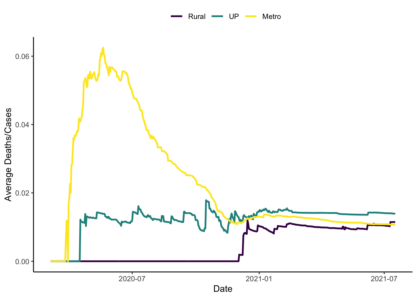
I used medians here instead of means because the means seemed to be pulled by some outliers.The insights we gain here are:
- In terms of cases/capita, all three types of areas seem to be doing quite similarly in general.
- Cases picked up in metro areas first, then urban areas then rural areas, on average. It looks like the lag is about a week moving from larger to smaller areas.
- Deaths are better in rural areas than other places and better in non-metro places with substantial urban populations than in metro areas.
- In terms of the death rate, \(\frac{\text{Deaths}}{\text{Cases}}\), things are much worse in metro areas than in the other two types of places.
You Try It!
I have compiled a similar dataset (with most of the same variables, though not the public health ones beyond the COVID stuff) for Minnesota. Using the same process above, how do the insights from Minnesota differ from those for Colorado.